Origin of the Rule of Thirds: Photography’s Golden Rule

Photography, with its perfect blend of art and science, offers myriad techniques that can be leveraged to capture stunning visuals. One of the most celebrated principles guiding photographers around the world is the ‘Rule of Thirds’. This rule, in its elegant simplicity, has helped produce some of the most powerful and balanced images in the history of the medium. To fully appreciate the impact of the Rule of Thirds, it’s beneficial to trace its roots back to its inception.

The Birth of the Rule

Despite its deep ties with photography, the rule of thirds was not initially a photographic concept. The origins of this rule trace back to John Thomas Smith’s 1797 book “Remarks on Rural Scenery” where Smith coined the term, discussing the balance of light and dark in a painting. This concept was deeply inspired by the theories of the golden ratio, dating back to the ancient Greeks.

The golden ratio or ‘divine proportion’ was widely used in Greek architecture and later by Renaissance artists. This ratio occurs when a line is divided into two parts such that the longer part divided by the smaller part is equal to the whole length divided by the longer part. It creates a visually pleasing balance that is thought to mirror patterns found in nature.

The Intersection with Photography

The evolution of the rule of thirds into photography is a fascinating tale of art adapting to technology. With the advent of cameras in the early 19th century, painters’ techniques were applied to the new medium to establish compositional norms.

In the 1860s, photographic societies began to formulate principles to guide the emerging field. During these discussions, the rule of thirds started gaining recognition among photographers.

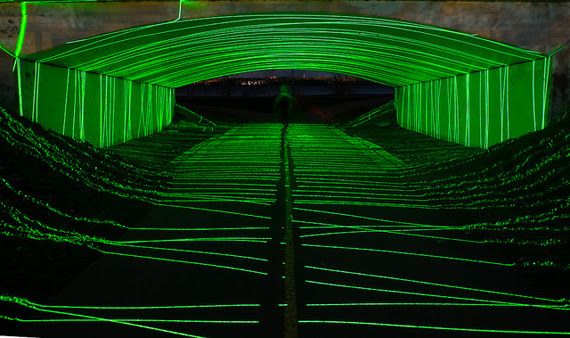
The rule suggested that an image should be imagined as divided into nine equal parts by two equally spaced horizontal lines and two equally spaced vertical lines. Important compositional elements should be placed along these lines or their intersections. This technique gave images more tension, energy, and interest than simply centering the subject would.

Influence and Contemporary Use

In modern times, the rule of thirds has become a foundational principle of not only photography but also of visual arts such as design, painting, and even film-making. It’s extensively used in landscape photography, portraiture, and virtually any scenario where an engaging composition is required.

In landscape photography, the horizon line is often placed along one of the horizontal lines to emphasize either the sky or the land. In portraiture, the subject’s eyes are often placed on one of the intersection points to draw the viewer’s attention.

The rule of thirds has also found application in the digital space, guiding website and graphic design. Furthermore, many cameras and smartphones now offer a grid overlay function, making it easy for everyone, professionals and beginners alike, to experiment with this rule.

In Conclusion:

It’s fascinating how the rule of thirds, a principle that started its journey centuries ago in the field of painting, has remained relevant across multiple shifts in artistic mediums. It’s a testament to the enduring nature of the principle and its ability to create aesthetically pleasing and balanced compositions.

Wildlife Photography: Tips for Better Composition

For a nature photographer, composition can be a daily challenge. In wildlife photography, the challenge is even greater. Not only are you trying to satisfy your own creative vision, but you also have to deal with a subject which may have no interest in having its photo taken.

“A Very Cute Puffin” captured by PictureSocial member Ulka Nast

I can’t help you much with an uncooperative subject. Rest assured that with practice and experience, you will find that you become much quicker at composing and exposing a photo so that you get the shot before the critical moment passes. There are a couple of simple tips that can make things a little easier.

First, practice your photography in places where the animals are used to having people around and are less likely to become jittery at your presence. This does not have to be a zoo or other enclosure. Most national parks have campgrounds and picnic grounds where the wildlife is used to being around people and may even come closer looking for food. You have a much better chance of a shot if you can get close without frightening the subject away.

“Moment of a Monkey” captured by PictureSocial member Dietmar Chromik

Second, try to organize your exposure before you set up the shot. If the light is fairly constant, it is possible to point your camera in the right general direction and work out the best aperture and shutter speed settings for the photo. Then when you approach the subject, you can concentrate on composition without having to waste time working out your exposure.

These simple tips may help to take some of the frustration out of wildlife photography, but what about the composition itself? Many people simply don’t know where to start. If that sounds like you, don’t be discouraged. Like I said at the beginning, composition can be tough — even for a photographer with years of experience.

Let’s start by breaking it down into two categories: close-up and non-close-up photos.

In a close-up photo, the subject fills most of the frame.

A lot of people get in a tangle over whether to position their subject in the middle or to one side of the composition. In my experience, it is quite acceptable to have the subject right in the center, as long as you allow some head-room so it doesn’t appear too cramped within the confines of the composition. A central position is especially suitable when the subject is looking straight at the camera, but it often works just as well if the subject is facing a little to one side or the other.

The more space you have around the subject, the more you should consider putting it to one side or the other. You should be guided by the way the animal is facing. If it is looking to one side, position it a little towards the other side so it is looking toward the center of the frame. So, if your wildlife subject is looking right, position it a little to the left. Not too far — you don’t want half of your photo to feature nothing but empty space.

In a non-close-up, where the photo shows a lot more space around the animal, it becomes more critical that you use that space effectively. In situations where the animal is featured with a lot of background, it may be better to think of the picture as a landscape photograph, and compose it accordingly. Some of the tried-and-true techniques, like the Rule of Thirds, are a good way to help you position your subject within the overall frame of the picture.

For a landscape-style photo, it may look quite unbalanced to position your subject in the center of the picture. It is usually better to position it to one side or the other, and it is even more important to have the animal facing toward the center of the picture. The eyes of an animal subject can have a strong effect on the direction in a composition; we tend to look where they are looking. So if the animal is on the left and looking left, the visual flow of the composition will lead out of the picture instead of into it. If the subject is on the left and looking right, the viewer will follow the gaze of the subject into the center of the picture.

Naturally, it helps if there is something of interest in the center or to the right to catch the viewer’s attention and add interest to the composition. If the subject is looking into the composition, it makes sense that it is looking at something, not just at empty space. Almost anything will do — a tree, a beach, an impressive sky — as long as it adds impact to the composition. If there is nothing of interest to work with, you might consider zooming in closer, so there is less emptiness in the frame.

These simple guidelines are intended to do nothing more than give you some ideas. Nature is not governed by the rules of composition, and a wildlife photographer must be flexible to get the best result out of each situation. Above all, trust your own judgment — your own sense of visual balance — to create a satisfying composition. On the other hand, if you are struggling to get started, think back to these guidelines; if you can position your subject well, the rest of the composition will fall into place.

What Lenses Work Best for Beautiful Background Blur?

Here is a portrait that uses background blur to make the model pop from the background.

Background blur is an excellent composition tool to set your subject apart from their surrounding areas. It’s another way of saying “minimum depth of field”.

Newer photographers, with entry-level equipment, often find the idea of background blur difficult, because no matter what they do they cannot create the effect.

Blurring a background requires several elements of photography to be successful. First and foremost is the lens.

For that reason, in this article, we will concentrate on lens selection to create optimal background blur.

Quick Tip

Your first consideration when blurring a background is the focal length of the lens.

The longer the focal length, the more blur will be created at a given f-stop.

For example, at f/2.8, a 200mm lens will create more background blur than a 50mm lens.

Wide-angle lenses will not create a noticeable background blur effect at any f-stop.

Any lens wider than a “normal” field-of-view lens will create a negligible background blur, even when you have set the f-stop to the widest opening.

A normal field of view is between 50 and 55mm for a full-frame sensor and 28-34mm on a camera with an APS-c sensor.

A “normal” lens is one that closely mimics the field of vision for the human eye.

The lens in the image above is most definitely not a “normal” lens. A very long telephoto lens like this would create background blur even at smaller apertures!

What about the relationship between aperture and background blur?

The photographic term “fast lens” refers to the largest aperture available on the lens. A lens with a very wide maximum aperture is a faster lens than a similar lens with a smaller maximum aperture.

This fact of optics is why creating background blur with kit lenses is difficult to impossible. They generally have a smaller maximum aperture.

The lens above has a maximum aperture of f/1.4. This lens would be considered very fast, and it would be extremely efficient at creating background blur.

This Canon 24-105mm zoom lens has a maximum aperture of f/4. This lens is not as fast a lens as compared to the previous example, where the maximum aperture was f/1.4.

Some lenses display the aperture scale outside the lens (such as the Nikon 85mm).

Other lenses only display the aperture scale inside the viewfinder, such as Canon 24-105mm zoom lens.

Most lenses have variable apertures. The one exception is mirror lenses. They have a fixed aperture, usually around f/8.

Quick Tip

With a zoom lens (variable focal length), such as the Canon example, the lens will create more background blur at a longer focal length setting versus a shorter focal length setting.

For example, this Canon lens set at the maximum aperture of f/4 will create more background blur at the 105mm focal length setting versus the 24mm focal length setting (where it would create little to no background blur).

Conclusion: When selecting a lens for background blur…

  • A lens with a longer focal length works better than a shorter one.
  • A lens with a wider maximum aperture works better than a lens with a smaller one.
  • A “fast lens” is one that has a large maximum aperture (f/2.8 or larger).
  • Kit lenses, as a general rule, are not very fast and therefore do a poor job of creating background blur.
  • Wide-angle lenses are also a poor choice for creating background blur.
  • A lens focal length starting at a “normal” field of view (matching the human eye) and escalating toward longer focal lengths (telephoto) creates the best background blur.
  • When using a zoom lens (variable focal length), the longest focal length will create a better background blur than the shorter focal lengths at the maximum aperture.

Note: Some zoom lenses have a “variable” maximum aperture. You would want to consider this when choosing a focal length for background blur with a zoom lens.


Light Painting Photography Techniques: 7 Useful Tips

Light painting is a fun photography technique where photographers use camera flashes, flashlights, and spotlights to paint light in a scene. It can easily qualify as the best/most fun night photography technique. Although many photographers have attempted it before, only a few have mastered the technique. Below are some very useful tips to consider when you want to perfect your light painting skills.

1. Try out different light sources

This is very important You shouldn’t try painting everything using the same light. To avoid odd and flat pictures, consider using different light sources, otherwise your work will defy the sole purpose of light painting, which is to create unique light impressions on different landscape parts at night.

2. Use dimmable light sources

For the best results, you need to choose dimmable light sources, because light painting relies heavily on light intensity. To get the best results, you must be able to alter light intensity whichever way you like to ensure every part of a photo gets the right amount of light.

3. Take care of the noise

It is important to note that long exposures create more noise. Because of this, take time painting in light, but don’t forget to factor in this small detail; it can be the difference between good and bad lighting photography.

4. Take multiple shots

To get the best light painting photos, you need to take as many shots as possible. Multiple shots help you treat different parts of a photo separately which should be the case in light painting.

5. Use flashlights that don’t have hot spots

Moving your flashlight beam randomly when taking light photos doesn’t make a big difference even if your flashlight has a hot spot (a bright circle located at the center of the beam). The hotspot does, however, make a big difference when you are considering fine details in scenes. If you don’t have money to buy the perfect flashlight, consider taping tissue paper or wax paper over your flashlight lens to eliminate hot spots.

6. Include night photography techniques

Just because you are light painting shouldn’t mean you forget typical night photography techniques. You must consider techniques like mirror lockup, cable release, long exposure noise reduction, etc., to ensure you get the best outcome.

7. Mix ambient light

You should also remember to incorporate ambient light—like street lights or moon light—to add mood to your photos. Using flashlights shouldn’t mean you ignore all other light sources.

Keep these tips in mind next time you head out for a light painting shoot.

The Photographer’s Palette: The Role of Color in Composition

Colors are the silent narrators of the stories that unfold through photography. They can evoke emotions, guide the viewer’s eye, and create a compelling composition. Photographers, both amateurs and professionals, should consider color as an essential tool in their creative arsenal to enhance the visual storytelling experience. In this blog post, we delve into the importance of color in photography composition and how you can use it effectively.

The Role of Color in Photography Composition

Photography is a visual medium that relies heavily on composition, the arrangement of visual elements within a scene. A well-composed photo has a balance of elements that guide the viewer’s eye through the image, creating a visually pleasing and engaging experience.

One of these elements, often overlooked, is color. Colors can have different psychological effects on the viewer. They can stimulate emotions, highlight subjects, create depth, and even convey concepts and ideas. Understanding the role of color in photography can, therefore, elevate your compositions, taking your photos from merely “good” to “outstanding.”

Color Theory and The Color Wheel

Before diving into the practical aspects, understanding some basics of color theory can be beneficial. Central to color theory is the color wheel, which includes primary colors (red, blue, yellow), secondary colors (green, orange, purple), and tertiary colors – the result of mixing a primary and a secondary color.

Colors opposite each other on the color wheel are complementary colors, and when used together, they create a vibrant contrast. Analogous colors, those close together on the wheel, can establish a sense of harmony and cohesion.

Using Color in Photography Composition

  1. Complementary Colors: Complementary colors can make your subject pop, making the viewer’s eye immediately drawn to it. The stark contrast created by these color pairings can add a dramatic effect to your photographs.
  2. Analogous Colors: Using analogous colors can create a sense of harmony and consistency. These colors work well together and create a calming, peaceful effect. They are excellent for capturing serene landscapes, quiet street scenes, or intimate portraits.
  3. Monochrome: A monochrome color palette doesn’t mean just black and white. It involves using different shades, tints, and tones of a single color. This approach can produce a striking, impactful image by playing with light and shadows.
  4. Color and Mood: Colors can evoke a specific mood. Warm colors (red, orange, yellow) typically stir up feelings of warmth and comfort, while cool colors (blue, green, purple) elicit feelings of calm and relaxation. Use color to enhance the atmosphere or emotion you want to convey in your photograph.
  5. Color as a Leading Line: Color can be used as a leading line to guide the viewer’s eye towards your subject or a specific area in your image. Bright, saturated colors tend to draw attention, so use them strategically.
  6. Color for Depth and Dimension: You can use color to add depth and dimension to your photos. Warm colors appear closer to the viewer, while cool colors seem to recede into the background.

Understanding Color Balance and Post-Processing

In digital photography, understanding color balance is crucial. Cameras interpret colors differently than the human eye, so adjusting the color balance, usually through White Balance settings, can significantly influence the overall mood of your photograph.

In post-processing, tools like Photoshop or Lightroom can help correct color balance, adjust saturation and vibrancy, or apply color grading to further emphasize the mood or narrative you want to express.

Final Thoughts

In the world of photography composition, color is a powerful tool waiting to be fully exploited. Mastering the use of color takes practice and experience, but once you grasp its potential, your photos will never be the same. So, the next time you’re framing a shot, consider not just the subjects and shapes, but the colors and the story they can tell. After all, every hue in your palette is another word in your photographic vocabulary.