
The Photographer’s Palette: The Role of Color in Composition
Colors are the silent narrators of the stories that unfold through photography. They can evoke emotions, guide the viewer’s eye, and create a compelling composition. Photographers, both amateurs and professionals, should consider color as an essential tool in their creative arsenal to enhance the visual storytelling experience. In this blog post, we delve into the importance of color in photography composition and how you can use it effectively.
The Role of Color in Photography Composition
Photography is a visual medium that relies heavily on composition, the arrangement of visual elements within a scene. A well-composed photo has a balance of elements that guide the viewer’s eye through the image, creating a visually pleasing and engaging experience.
One of these elements, often overlooked, is color. Colors can have different psychological effects on the viewer. They can stimulate emotions, highlight subjects, create depth, and even convey concepts and ideas. Understanding the role of color in photography can, therefore, elevate your compositions, taking your photos from merely “good” to “outstanding.”
Color Theory and The Color Wheel
Before diving into the practical aspects, understanding some basics of color theory can be beneficial. Central to color theory is the color wheel, which includes primary colors (red, blue, yellow), secondary colors (green, orange, purple), and tertiary colors – the result of mixing a primary and a secondary color.
Colors opposite each other on the color wheel are complementary colors, and when used together, they create a vibrant contrast. Analogous colors, those close together on the wheel, can establish a sense of harmony and cohesion.
Using Color in Photography Composition
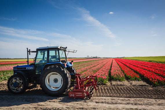
- Complementary Colors: Complementary colors can make your subject pop, making the viewer’s eye immediately drawn to it. The stark contrast created by these color pairings can add a dramatic effect to your photographs.
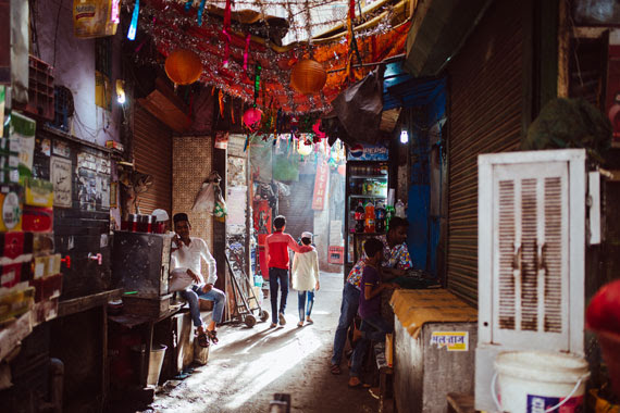
- Analogous Colors: Using analogous colors can create a sense of harmony and consistency. These colors work well together and create a calming, peaceful effect. They are excellent for capturing serene landscapes, quiet street scenes, or intimate portraits.
- Monochrome: A monochrome color palette doesn’t mean just black and white. It involves using different shades, tints, and tones of a single color. This approach can produce a striking, impactful image by playing with light and shadows.
- Color and Mood: Colors can evoke a specific mood. Warm colors (red, orange, yellow) typically stir up feelings of warmth and comfort, while cool colors (blue, green, purple) elicit feelings of calm and relaxation. Use color to enhance the atmosphere or emotion you want to convey in your photograph.
- Color as a Leading Line: Color can be used as a leading line to guide the viewer’s eye towards your subject or a specific area in your image. Bright, saturated colors tend to draw attention, so use them strategically.
- Color for Depth and Dimension: You can use color to add depth and dimension to your photos. Warm colors appear closer to the viewer, while cool colors seem to recede into the background.
Understanding Color Balance and Post-Processing
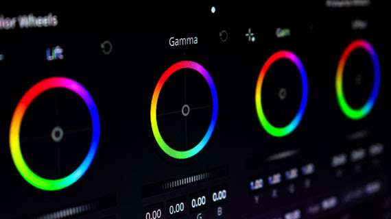
In digital photography, understanding color balance is crucial. Cameras interpret colors differently than the human eye, so adjusting the color balance, usually through White Balance settings, can significantly influence the overall mood of your photograph.
In post-processing, tools like Photoshop or Lightroom can help correct color balance, adjust saturation and vibrancy, or apply color grading to further emphasize the mood or narrative you want to express.
Final Thoughts
In the world of photography composition, color is a powerful tool waiting to be fully exploited. Mastering the use of color takes practice and experience, but once you grasp its potential, your photos will never be the same. So, the next time you’re framing a shot, consider not just the subjects and shapes, but the colors and the story they can tell. After all, every hue in your palette is another word in your photographic vocabulary.