8 of the Most Important Photoshop Tools for Photographers

Photoshop is one of the most well known and most commonly used image editing software programs in the world. It’s used worldwide both personally and professionally. When people see a picture they believe too good to be true, the reply is often the same: “That’s Photoshopped.” What many people don’t realize is that many of the images you think are just perfect shots are touched up using Photoshop, whether that be adding a little brightness or totally removing an undesirable person or section. When Photoshop is used correctly and not over done, it can make amazing imagery even better!
While every tool in Photoshop has its use, and, when you know what you’re doing should definitely not be overlooked! One thing you need to remember is that Photoshop isn’t there to “fix” a photograph, a bad photograph is always going to be a bad photograph. Of course the tools you find useful are going to differ to those someone else finds useful, so it’s all a matter of opinion, but if you have a great photograph and it just needs that little touch up, then here are our eight of the most important Photoshop tools for photographers:

1. Hue and Saturation

The Hue and Saturation tool enables you to control the colors in your images based on, well, their hue and saturation. To open the Hue/Saturation tool you can go to Image > Adjustments > Hue/Saturation.

Hue refers to the color in your image. Changing this will change the colors in your photograph and so this setting is usually best left untouched.

The tool you’re more likely to use here is saturation; this is the intensity and richness of the colors in the image. When saturating an image you can use the Master box found at the top of the Hue/Saturation toolbox to choose which colors you’d like to saturate. The colors you’re going to want to saturate most are the reds and yellows in your image rather than the blues. Adjusting the saturation allows you to make it look more natural and dramatic while not changing the colors or image too drastically.

2. Cropping

This is one of the more simple tools you’ll find yourself using, but that doesn’t make it any less valuable. Cropping is a valuable tool for photographers as it allows them to prep an image for posting online or printing: taking an image and changing its size and/or removing unnecessary empty areas. You can save presets for various sizes and resolutions, enabling you to crop images specifically for various reasons.
3. Layers

Layers are another simple tool that any Photoshop user knows how to use. But while simple, this tool is actually one of the most useful. Layers allow you to work on parts of an image without changing others. There really isn’t much more to say about layers than that, they allow you to layer various edits and section each, remaining its own separate section and having no impact on any other.

4. Levels

The levels tool allows you to correct the tonal range and color balance of an image by adjusting the intensity levels of images shadows, highlights and midtones. When editing the levels of an image you are shown a histogram, which is essentially just a visual guide for adjusting the image tones. You can find the levels tool by going to Image > Adjustments > Levels.

The histogram represents the dark and light tones within the image. If your histogram is mainly pushed to the left hand side it represents darker tones in your image, whereas the right hand side shows brighter tones. This is a tool you’ll likely find hard to use, but with slow adjustments you’ll notice how it can influence your images.

5. Sharpening

Sharpening is a hard tool to use; it requires a lot of practice and a very steady hand with a mouse. Sharpening an image is basically touching up all the lines and increasing their contrast, this will cause smaller features of an image stand out more. Sharpening your image is usually one of the last edits you’ll find yourself doing. The sharpen tool also has an “Auto Sharpen” command which may save you the time. When sharpening an image you should remember there is a fine line between sharpened and over-sharpened; over-sharpening an image will cause it to look unrealistic.

6. Healing Brush

The healing brush is used to replace scratches and small specs you might have noticed in your image. It works like a paintbrush tool but allows you to take a “perfect” part of your image (let’s say you focus on the blue of the sky) and copy that part of your image over the top of the spec or scratch you’ve found within your image. This tool will attempt to blend the section you’re copying with the area you’re covering; this means nothing looks out of place.

7. Exposure

Exposure adjustment corrects the tonal values or lightness of HDR (High Dynamic Range) images. You can find the exposure tool in Images > Adjustments > Exposure. This allows you to edit three settings: Exposure (this adjusts the highlights of your image while ignoring the darker areas of your image), Offset (this darkens the shadows and midtones of your image while ignoring the lighter areas), and Gamma (this adjusts the image’s gamma or midtone values).
8. Vibrance

The vibrance tool saturates the colors in your image, focusing mainly on increasing the intensity of colors in your image. Vibrance works much like saturation except it avoids skin tones (mainly oranges and yellows), so it’s perfect for images that contain people; it saturates their skin tone without making it seem unrealistic but adds to every other color in your image. A simple rule to follow is to use saturation when removing color from an image as it removes color from all colors, and vibrance when adding color. Vibrance essentially acts as a smart saturation, as it will only add color to the dull colors already in the image and not every color while avoiding skin tones.
Shutter Speed Determination for Hand-held Landscape Photos

Now generally I recommend a tripod for landscape photography, however, I do shoot a fair bit of hand-held landscapes too and trust me, I have had more than my share of blurry photos in my 15 odd years of photography.

Is there anything worse than a Blurry Masterpiece?

In my opinion, there is nothing worse than zooming into the best shot of the day, the miracle shot that captured the moment perfectly, only to discover it’s blurry.

Ok, so how do we shoot hand-held in tough conditions and make sure our photos have a good chance of being sharp?

Shutter speed is critical when shooting without a tripod. We need to shoot fast enough so that any camera shake is not visible in our final photo.

But what shutter speed is fast enough to avoid camera shake?

Interestingly, it varies depending on the focal length of the lens you are shooting with.

Wide-angle lenses are much easier to get sharp hand-held photos than telephoto, as you will see below

The rule of thumb that I use is:

2 times the focal length you are shooting is a good minimum shutter speed as a guide. Of course, the faster – the better chance of a good result.

You may find that with modern stabilized cameras and lenses that you can go even lower, however, I feel that 2x the focal length is a good minimum to start at.

Now you might be thinking, “what on earth is he talking about”.

Hopefully, this clears it up:

  • 20mm lens: 2 x 20 = 1/40th of a second as your minimum shutter speed for a 20mm lens.
  • 50mm lens: 2 x 50 = 1/100th of a second as your minimum shutter speed for a 50mm lens.
  • 100mm lens: 2 x 100 = 1/200th of a second as your minimum shutter speed for a 100mm lens
  • 400mm lens: 2 x 400 = 1/800th of a second as your minimum shutter speed for a 400mm lens.

Of course, the faster the better, if you can.

This won’t guarantee sharp photos every time but it will get you on the right track as far as shutter speed is concerned.

Below are further tips for the perfect hand-held Landscape photo.

• Raise your ISO to achieve at least the minimum shutter speed above.
• Brace yourself against a solid object to reduce camera shake.
• Choose a lens or camera with Image Stabilization.
• Set your camera to multiple shot mode and fire 3-4 consecutive shots. Generally, camera shake is at its highest on the first photo as we press the shutter and will settle down in the 2nd-3rd-4th shots of the sequence.

The Hierarchy of Compositional Elements in Photography

As photographers, we are storytellers, using the language of visual elements to translate the three-dimensional world onto a two-dimensional plane. Understanding the art of composition is crucial to capturing compelling images that narrate our unique perspective of the world. It’s like arranging the notes of a melody to create a harmonious song.

However, the concept of an “order” to follow when considering the elements of composition isn’t carved in stone. Each scene, each subject, and each moment brings unique aspects that might prompt us to prioritize one compositional element over another. But for the sake of learning and practicing, it’s helpful to establish a guideline or a hierarchy of these elements. Let’s break down the sequence of considerations you might follow when composing a shot.

1. Vision and Intent

Before delving into the technical aspects of composition, start with the question: “What is my intent with this photograph?” Your vision is the driving force behind your composition. Do you want to highlight a certain emotion, convey a story, or just capture the beauty of the scene? Understanding your purpose will guide your use of compositional elements.

2. Framing and Placement of the Subject

Once you’re clear on your intent, consider the placement of your subject within the frame. The Rule of Thirds is a widely accepted principle to guide this step. The idea is to divide the frame into nine equal parts with two equally spaced horizontal and vertical lines, then place the key elements of your scene along these lines, or at their intersections.

3. Use of Leading Lines

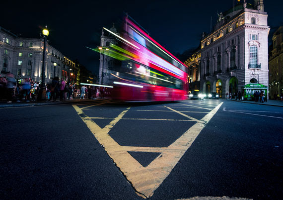
Leading lines are a powerful tool to guide the viewer’s eye towards the subject or a point of interest. These lines can be anything – a pathway, a stream, architectural elements, or even a gaze. The key is to identify these lines in your scene and align your shot to leverage them.

4. Depth and Perspective

Creating a sense of depth adds dimension and realism to your photographs. Play with elements like foreground, middle ground, and background. Use perspective and depth of field to create a three-dimensional effect in a two-dimensional medium.

5. Balance and Symmetry

Ensure that your image feels balanced, which can be achieved both symmetrically and asymmetrically. Symmetry provides a sense of harmony and proportion, while asymmetry, when balanced correctly, can make your image more dynamic and interesting.

6. Patterns and Textures

Patterns and textures can add a rich layer of depth to your photographs. They can either be the subject itself or complement the primary subject. Patterns provide a sense of rhythm, while textures can evoke tactile sensations making the image more immersive.

7. Lighting and Shadows

Lighting is not just an illuminator, but a storyteller. It can dramatically change the mood, texture, and tone of your photograph. The interplay of light and shadow is crucial for highlighting your subject, creating depth, and revealing textures.

8. Color and Contrast

Lastly, consider the color scheme and contrast. Colors can evoke emotional responses and set the mood. Contrast, on the other hand, can draw attention to your subject, guide the viewer’s eye, and add drama to your image.

Remember, while this hierarchy can be a helpful guide, it’s not a set of rigid rules. Composition is as much about intuition and personal style as it is about guidelines. The more you shoot, the more you develop an instinct for composing impactful images. So grab your camera, and let the world be your canvas!

Origin of the Rule of Thirds: Photography’s Golden Rule

Photography, with its perfect blend of art and science, offers myriad techniques that can be leveraged to capture stunning visuals. One of the most celebrated principles guiding photographers around the world is the ‘Rule of Thirds’. This rule, in its elegant simplicity, has helped produce some of the most powerful and balanced images in the history of the medium. To fully appreciate the impact of the Rule of Thirds, it’s beneficial to trace its roots back to its inception.

The Birth of the Rule

Despite its deep ties with photography, the rule of thirds was not initially a photographic concept. The origins of this rule trace back to John Thomas Smith’s 1797 book “Remarks on Rural Scenery” where Smith coined the term, discussing the balance of light and dark in a painting. This concept was deeply inspired by the theories of the golden ratio, dating back to the ancient Greeks.

The golden ratio or ‘divine proportion’ was widely used in Greek architecture and later by Renaissance artists. This ratio occurs when a line is divided into two parts such that the longer part divided by the smaller part is equal to the whole length divided by the longer part. It creates a visually pleasing balance that is thought to mirror patterns found in nature.

The Intersection with Photography

The evolution of the rule of thirds into photography is a fascinating tale of art adapting to technology. With the advent of cameras in the early 19th century, painters’ techniques were applied to the new medium to establish compositional norms.

In the 1860s, photographic societies began to formulate principles to guide the emerging field. During these discussions, the rule of thirds started gaining recognition among photographers.

The rule suggested that an image should be imagined as divided into nine equal parts by two equally spaced horizontal lines and two equally spaced vertical lines. Important compositional elements should be placed along these lines or their intersections. This technique gave images more tension, energy, and interest than simply centering the subject would.

Influence and Contemporary Use

In modern times, the rule of thirds has become a foundational principle of not only photography but also of visual arts such as design, painting, and even film-making. It’s extensively used in landscape photography, portraiture, and virtually any scenario where an engaging composition is required.

In landscape photography, the horizon line is often placed along one of the horizontal lines to emphasize either the sky or the land. In portraiture, the subject’s eyes are often placed on one of the intersection points to draw the viewer’s attention.

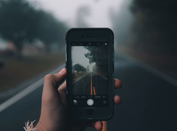
The rule of thirds has also found application in the digital space, guiding website and graphic design. Furthermore, many cameras and smartphones now offer a grid overlay function, making it easy for everyone, professionals and beginners alike, to experiment with this rule.

In Conclusion:

It’s fascinating how the rule of thirds, a principle that started its journey centuries ago in the field of painting, has remained relevant across multiple shifts in artistic mediums. It’s a testament to the enduring nature of the principle and its ability to create aesthetically pleasing and balanced compositions.

Wildlife Photography: Tips for Better Composition

For a nature photographer, composition can be a daily challenge. In wildlife photography, the challenge is even greater. Not only are you trying to satisfy your own creative vision, but you also have to deal with a subject which may have no interest in having its photo taken.

“A Very Cute Puffin” captured by PictureSocial member Ulka Nast

I can’t help you much with an uncooperative subject. Rest assured that with practice and experience, you will find that you become much quicker at composing and exposing a photo so that you get the shot before the critical moment passes. There are a couple of simple tips that can make things a little easier.

First, practice your photography in places where the animals are used to having people around and are less likely to become jittery at your presence. This does not have to be a zoo or other enclosure. Most national parks have campgrounds and picnic grounds where the wildlife is used to being around people and may even come closer looking for food. You have a much better chance of a shot if you can get close without frightening the subject away.

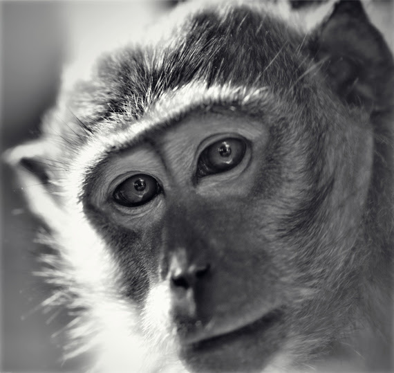
“Moment of a Monkey” captured by PictureSocial member Dietmar Chromik

Second, try to organize your exposure before you set up the shot. If the light is fairly constant, it is possible to point your camera in the right general direction and work out the best aperture and shutter speed settings for the photo. Then when you approach the subject, you can concentrate on composition without having to waste time working out your exposure.

These simple tips may help to take some of the frustration out of wildlife photography, but what about the composition itself? Many people simply don’t know where to start. If that sounds like you, don’t be discouraged. Like I said at the beginning, composition can be tough — even for a photographer with years of experience.

Let’s start by breaking it down into two categories: close-up and non-close-up photos.

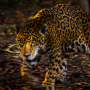
In a close-up photo, the subject fills most of the frame.

A lot of people get in a tangle over whether to position their subject in the middle or to one side of the composition. In my experience, it is quite acceptable to have the subject right in the center, as long as you allow some head-room so it doesn’t appear too cramped within the confines of the composition. A central position is especially suitable when the subject is looking straight at the camera, but it often works just as well if the subject is facing a little to one side or the other.

The more space you have around the subject, the more you should consider putting it to one side or the other. You should be guided by the way the animal is facing. If it is looking to one side, position it a little towards the other side so it is looking toward the center of the frame. So, if your wildlife subject is looking right, position it a little to the left. Not too far — you don’t want half of your photo to feature nothing but empty space.

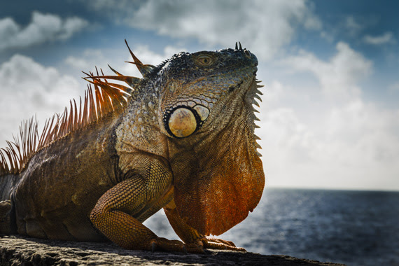
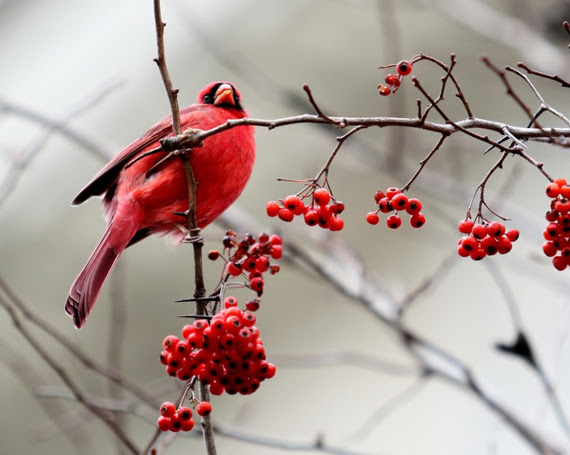
In a non-close-up, where the photo shows a lot more space around the animal, it becomes more critical that you use that space effectively. In situations where the animal is featured with a lot of background, it may be better to think of the picture as a landscape photograph, and compose it accordingly. Some of the tried-and-true techniques, like the Rule of Thirds, are a good way to help you position your subject within the overall frame of the picture.

For a landscape-style photo, it may look quite unbalanced to position your subject in the center of the picture. It is usually better to position it to one side or the other, and it is even more important to have the animal facing toward the center of the picture. The eyes of an animal subject can have a strong effect on the direction in a composition; we tend to look where they are looking. So if the animal is on the left and looking left, the visual flow of the composition will lead out of the picture instead of into it. If the subject is on the left and looking right, the viewer will follow the gaze of the subject into the center of the picture.

Naturally, it helps if there is something of interest in the center or to the right to catch the viewer’s attention and add interest to the composition. If the subject is looking into the composition, it makes sense that it is looking at something, not just at empty space. Almost anything will do — a tree, a beach, an impressive sky — as long as it adds impact to the composition. If there is nothing of interest to work with, you might consider zooming in closer, so there is less emptiness in the frame.

These simple guidelines are intended to do nothing more than give you some ideas. Nature is not governed by the rules of composition, and a wildlife photographer must be flexible to get the best result out of each situation. Above all, trust your own judgment — your own sense of visual balance — to create a satisfying composition. On the other hand, if you are struggling to get started, think back to these guidelines; if you can position your subject well, the rest of the composition will fall into place.