How to Create Stunning Portraits of Your Dog
Photographing your dog can be a terrific way to not only get amazing photos of a beloved family member, it’s also good practice and will sharpen your over all photography skills.
Like any other portrait session, the first step is to mentally pre-visualize what you want the end result to be. Please don’t skip this step. Hit or miss, shooting tons of pictures, hoping one will “turn out good” just doesn’t cut it. It is SO much easier to get a good portrait if you have a clearly defined idea of what you want.
What type of dog is it? Is it a large “working dog” type? Or a frilly lap dog? These questions will help determine the best backdrop. An Irish Setter posed at sunset in a field of wild grasses would be stunning. Stick your Chihuahua in there and you may never find it again! Conversely, a Chihuahua sitting on the brim of a large Mexican hat would be adorable. The Irish Setter sitting there would be ludicrous. (And crush the hat!)
Will your dog stay on command? It can be frustrating to get your dog positioned just right, and then every time you back up to take the shot, the dog (lovingly) follows you. If you’re alone, you may have to take the dog back and reposition him several times before the idea sinks in. Don’t get mad, they don’t really understand what’s going on. Yelling at your dog won’t help; it will just make them feel bad and the hurt expression will ruin any shots you finally DO get.
By the way, don’t give the dog treats as a way to make them stay in place. They will be looking down at and chewing on the food, and you won’t be able to get a good shot. Then, as soon as the treat is gone, they’ll come over to you, hoping for more.
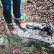
If you can, get someone to help pose the dog. That way, you’re in position and ready to snap the shutter the instant you see a good shot. Use a long lens so the field of view is very narrow. This will allow your helper to stay near the dog, and they can grab it every time it starts to move. Sooner or later, the dog will get the idea and just sit there posing for you.
Speaking of long lenses, not only do they allow your posing helper to stay near the dog, but they allow you to fill the frame with your subject!
This is Vital!
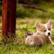
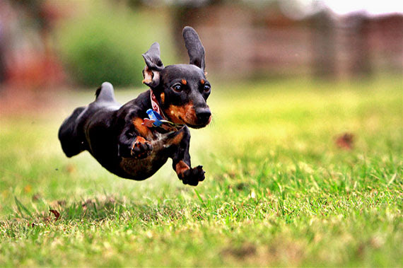
The number one thing that ruins pet portraits is making your pet too small in the frame. We see this beautiful scene, shoot it and when we look at the final print, our dog is nothing but a tiny blob, somewhere down in the corner. Fill the frame! If you end up totally eliminating the background, that’s better than not being able to see your subject. (Same with people.)
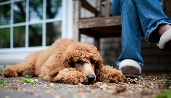
Shoot at the dog’s level. Unless you are VERY short and your dog is VERY tall, I can’t imagine a session where you aren’t down on one knee, or both, or prone on the ground.
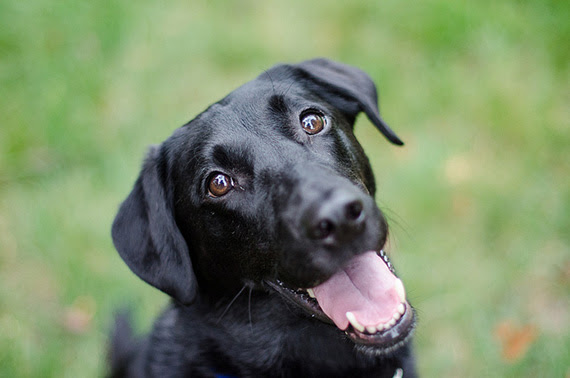
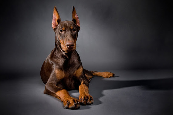
Focus on the eyes. Sharp eyes are vital and can save many otherwise not so hot photos. Get back far enough so that the eyes can be sharp without blurring or distorting the nose. Be sure to get a catch light in the eyes. You may as well just toss any shots that don’t have catch lights, they aren’t worth keeping.
The dog has to look alert and attentive. This is accomplished by making sure the ears are UP. Here’s how. Without the dog knowing, have a squeaking dog toy. When the dog is positioned properly, squeak it. The dog will whip its head around to you; its ears will be at attention and it will have a fantastic, attentive expression.
Be Ready and Focused
The instant the dog looks, snap the shot! Auto focus is best so the shutter button is already halfway depressed. You have to be fast! Reading the last sentence takes longer than the photo should take. A lot longer!
Take bunches of shots of each pose. It’s amazing how fast a dog can lap its tongue over its nose.
Poses
You’ll want to get at least one shot of them lying down at a 45 degree angle to the camera (both from the right side and from the left) and one straight on to the camera. Sitting, the same sequence. Then zoom in and get a full frame head shot, then back off a little for a head and shoulders view or if lying down get head and front paws—like the Sphinx. Have your posing helper get the dog’s attention by gently talking to her while you get a few 3/4 and full profiles.